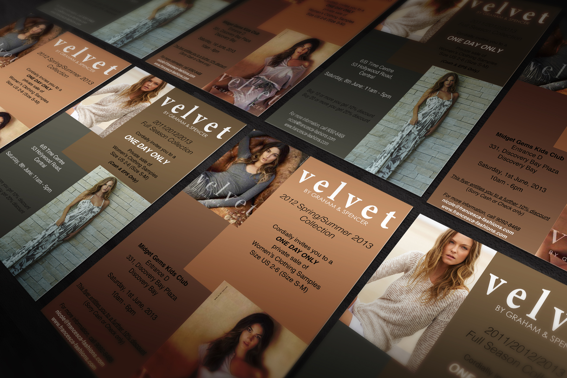
BRAND IDENTITY
Myzen

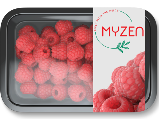
The client brief was to modernize their old logo, creating a design that is fresh and communicates their passion for fresh fruit. In alignment with the client’s request for a red and green color palette, the new logo was crafted within a circular shape to symbolize the concept of a “family circle” that underpins their business ethos.
Myzen is comprised of a dedicated team of experienced and internationally diverse individuals who share a commitment to quality fresh fruit. They collaborate with top-tier growers from across the globe to ensure that customers receive delicious, healthy, and nutritious fruits, including cherries, blueberries, raspberries, grapes, citrus fruits, and apples, all year round.
The client also requested business cards and a mockup for future packaging, which will reflect the updated branding and convey their core values of ethical and sustainable sourcing.


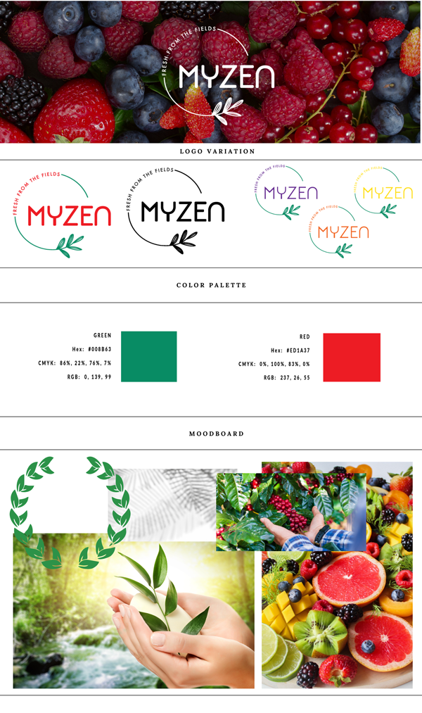
The newly designed logo is crucial for aligning with the client brief, capturing a fresh and modern look while reflecting Myzen’s core values and mission. Its circular shape symbolizes the family circle concept, fostering unity and community among the team and customers.
This design establishes an emotional bond, positioning Myzen as a trusted source for high-quality fruits. The vibrant red and green color scheme conveys freshness and health, highlighting the brand’s commitment to nutritious fruits and sustainable practices. The clean, modern design appeals to a health-conscious market, ensuring Myzen stands out in a competitive landscape.
Overall, the logo not only meets the client’s request for a contemporary update but also reinforces the brand’s mission of promoting high-quality, sustainably sourced fresh fruit, serving as a vital tool for brand loyalty and recognition.

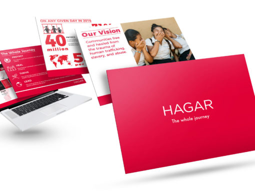
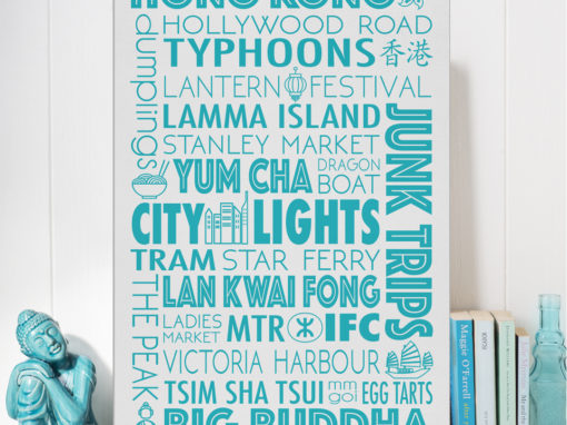
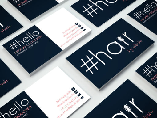
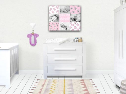
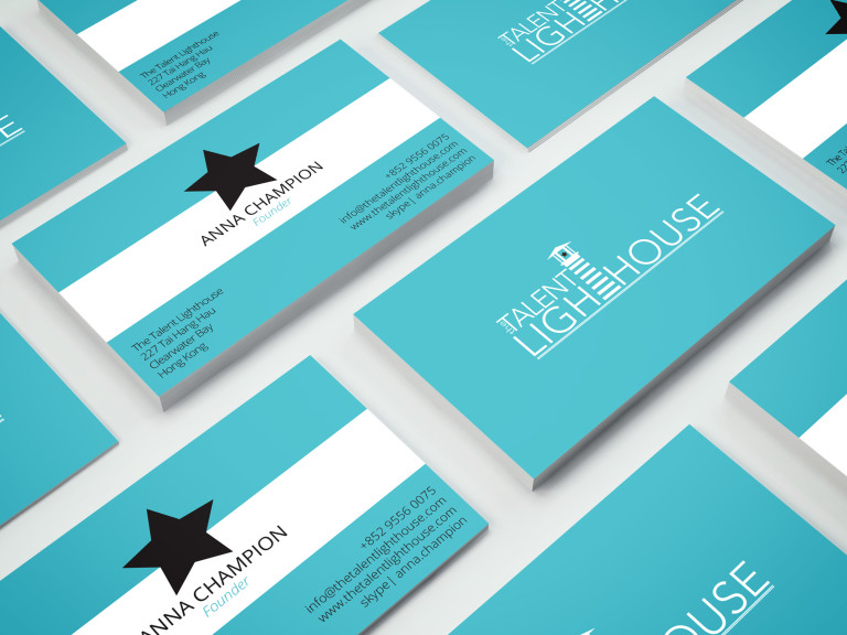
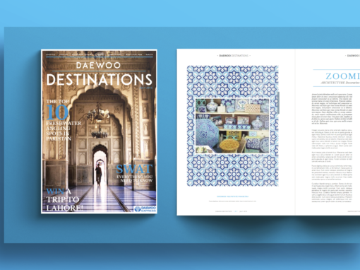
MORE PROJECTS